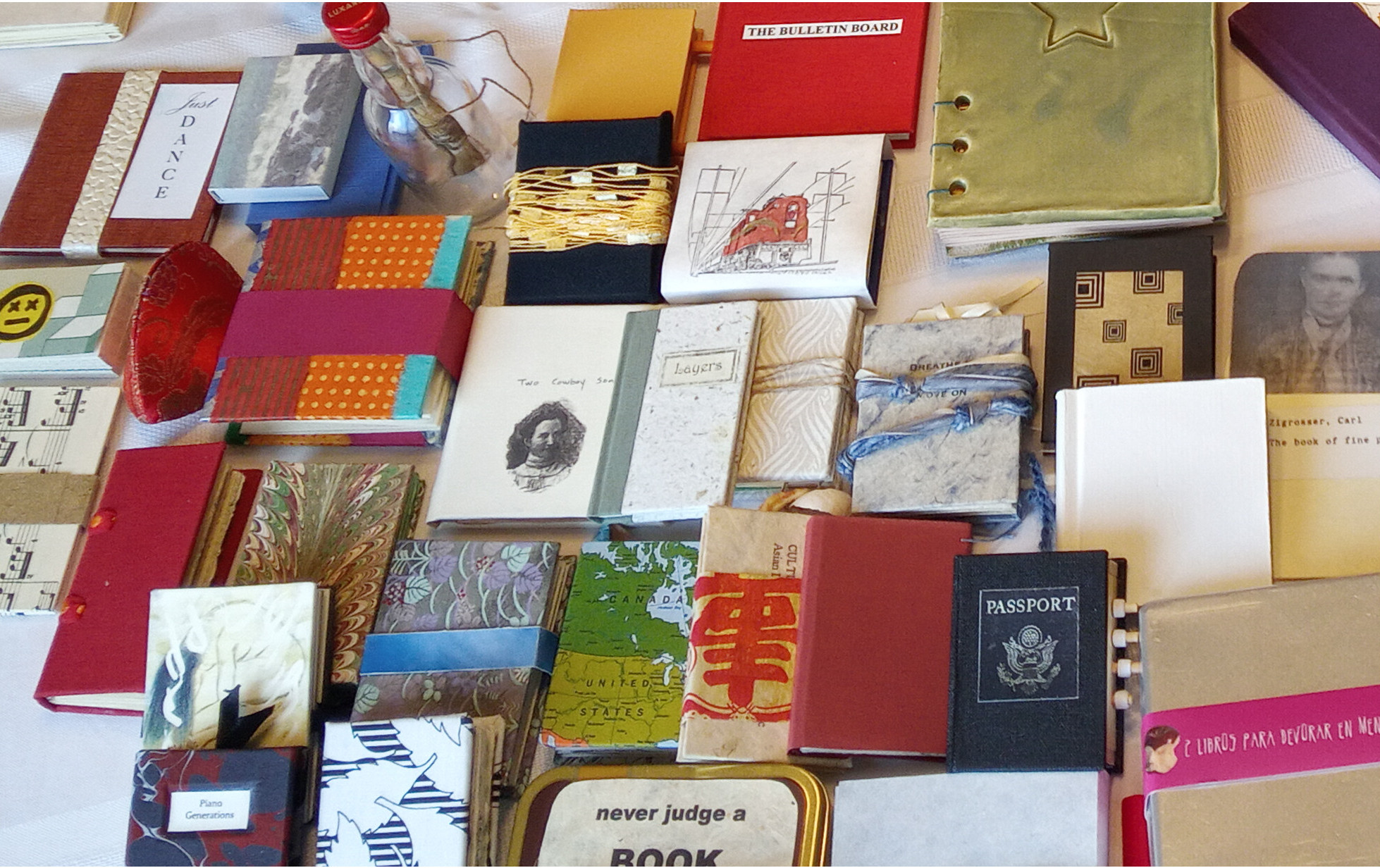
These super-sized, in-your-face, works of art are 'one of a kind' editions. Unlike most "hands off" exhibitions, here viewers are encouraged "please handle the work... do so with tenderness and care."
 Crisp, clean paper sheets are attached at each end to two vertical metal screw posts that stand
about 2.5 feet tall. The square metal rod base is about a foot wide. Each sheet of paper is
separated from the other by evenly-spaced hexagon metal nuts. The 36 alternating sheets
cover both sides of the posts, gently overlapping and progressively covering each other, like
tree branches. When lifted, each page reveals an imprinted single line of text that stands
alone, yet connects to the preceding page and the page that follows. Symmetrical, graceful and
precise is the overall effect of this pushing-the-boundary book.
Crisp, clean paper sheets are attached at each end to two vertical metal screw posts that stand
about 2.5 feet tall. The square metal rod base is about a foot wide. Each sheet of paper is
separated from the other by evenly-spaced hexagon metal nuts. The 36 alternating sheets
cover both sides of the posts, gently overlapping and progressively covering each other, like
tree branches. When lifted, each page reveals an imprinted single line of text that stands
alone, yet connects to the preceding page and the page that follows. Symmetrical, graceful and
precise is the overall effect of this pushing-the-boundary book. A singular rectangular gessoed canvas sheet with frayed sides and edges hangs like a medieval
banner on the gallery wall.
A singular rectangular gessoed canvas sheet with frayed sides and edges hangs like a medieval
banner on the gallery wall.This quiet, simple and subtle book commands our attention by its imposing size (19.5" wide by 36" long) which is contrasted by its faintly painted and difficult to read black text, making the viewer stop, linger and investigate.
 Instead of being elevated on a pedestal, this collage book's enormous open size (65" wide by
52" tall) demands that it be displayed on the gallery floor. Five double-page spreads of bold
collage pages (using paint, paper and photocopies) comprise this multi-layered, rough texture
book.
Instead of being elevated on a pedestal, this collage book's enormous open size (65" wide by
52" tall) demands that it be displayed on the gallery floor. Five double-page spreads of bold
collage pages (using paint, paper and photocopies) comprise this multi-layered, rough texture
book. "The book as sovereign," forces the reader to acknowledge this reverse power play by either bending over or kneeling down to engage with its huge 32.5" by 52" pages. The physical effort is worth the visceral and visual reward.
 Traditional quilts play with pattern and colour. This quilt plays with letters and words. The
medium is the metaphor - fragments of fabric comprise fragments of text.
This imposing (48" wide by 64.5" long) 12-panel quilt features white fabric block letters
appliquéd to a bold red fabric background. The resulting text message wraps around the quilt
border and circles inward. Sometimes the words appear in black fabric, calling out for our
attention, like bold face text. Curiously, sometimes the letters are not appliquéd, but pinned to
the fabric.
Traditional quilts play with pattern and colour. This quilt plays with letters and words. The
medium is the metaphor - fragments of fabric comprise fragments of text.
This imposing (48" wide by 64.5" long) 12-panel quilt features white fabric block letters
appliquéd to a bold red fabric background. The resulting text message wraps around the quilt
border and circles inward. Sometimes the words appear in black fabric, calling out for our
attention, like bold face text. Curiously, sometimes the letters are not appliquéd, but pinned to
the fabric.Each quilt block (14" wide by 15.5" long) is held together, not by tightly stitched thread, but at its corners with safety pins. As a result, when hung, the quilt does not lay flat, but sags with huge gaps that look like pouches. Upon closer examination, this optical illusion disappears. Is the subtext that the weight of the message is too great for the fabric to bear?
Almost all book structures require the reader to hold the book close in order to read and comprehend the text. However, in this case the opposite holds true. The reader needs to distance themselves from the book (i.e., quilt) in order to read and comprehend the text. Traditional bookbinding studies primarily focus on structure. The Pages Turning exhibition books integrate content with structure in unexpected and innovative ways.
Kehler's curatorial statement offers: "As time rolls on books may take on new purposes and forms of which we cannot conceive, and it is conceivable also that our relationship to them will change."
The Anna Leonowens Gallery is located on the cobblestoned Granville Street pedestrian mall of the Fountain Campus of NSCAD University in Halifax, Nova Scotia. Pages Turning is on display from July 11 to 15, 2023.
Review by Charles Salmon

 Celebration, (created in 2018), features six Victorian characters framed by a "proscenium arch" of salmon-coloured marbled paper. We the viewer are exposed to a playful scene from a doll's house of static paper dolls that are frozen in movement as they dance in a foyer, to music from a pianist and a minstrel. The outdoors beckon through garden gates in the background which frame a mottled blue sky.
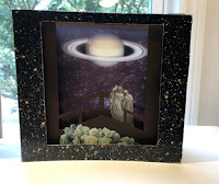 Two biblical figures in the mid-ground are as equally captivated by this celestial sight, as the crowd of 1930s fedora-topped men and women wrapped in turbans and furs in the foreground. Like the viewers in the tunnel book, our gaze is directed to the focal point of this creation - the legendary planet Saturn.


 At our group meeting yesterday, Joe Landry spoke to us about various box structures and presented a wide variety of samples from his collection.


 The Embodied Press: Queer Abstraction and the Artists' Book, is a retrospective exhibit of artists' books, currently on display at the
  The precision of these well-constructed artists' books is impressive. They consist mainly of editions versus one-of-a-kind creations.
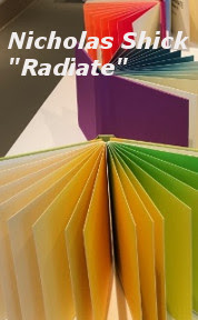
Nicholas Shick's series of 9 books entitled Radiate, is pure eye candy with each volume being a series of shades of one rainbow colour. Bound using the drum leaf technique and letterpress printed on Mohawk superfine paper stock, the books are displayed with all the pages fanned out and is a visual magnet.
The precision of these well-constructed artists' books is impressive. They consist mainly of editions versus one-of-a-kind creations.
Nicholas Shick's series of 9 books entitled Radiate, is pure eye candy with each volume being a series of shades of one rainbow colour. Bound using the drum leaf technique and letterpress printed on Mohawk superfine paper stock, the books are displayed with all the pages fanned out and is a visual magnet.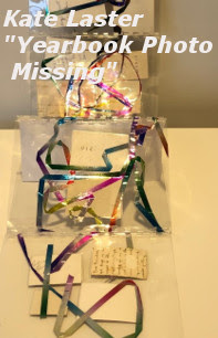 Lamination is used for a few books and these books in particular challenge our notion of book structure. Kate Laster's Yearbook Photo Missing consists of multi-coloured, laminated tinsel (that resembles ribbons) and found photos. However, it is the backs of the photos, each of which are each inscribed (and resemble cue cards), which face the viewer, not the photo image. And there is more transparent plastic than there is content. Blank paper pages in book construction are rarely questioned. Then why are pages that are made of transparent plastic so unsettling?
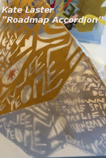 However, Kate Lester’s approach is not solely using cut-out patterns and graphics as Mexicans do, but Laster has substituted stylized letters of varying sizes that hint of folk art. The cut-out stencils get their power from seeing right through them. Laster also riffs on this form in Roadmap Accordion, where the book is laid out on the display table (like a road map) and the cut-out stencils get their power from the shadows created from the strong beam of light overhead. In this case, the message is amplified by the light and is ephemeral, like the material.
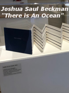 Stan Shellabarger has three accordion fold books on display, each of varying lengths, whose panels feature a series of swirly dots set against white and pale blue backgrounds, with solid dark blue front and back cover panels. The dots give this otherwise static display a fanciful sense of movement. Random dots are also used in Heidi Neilson's Atlas of Punctuation (letterpress in case binding), which only features periods. While the dots may appear randomly placed on the page, one is left wondering are they simply punctuation place holders for the text that has been completely removed.