
Earlier this summer, the Alcuin Society held their annual display of award-winning book
design at the Anna Leonowens Gallery in Halifax, NS. Held annually since 1984, the Alcuin Awards recognize excellence in
Canadian book design.
The travelling exhibit features over 25 books entered in the competition by Canadian
publishers and designers. Not surprisingly, the majority of the books are case bindings with
dust jackets, as well as perfect bindings, with cover printing. The majority of the award-winning
book covers are printed full colour (plus bleed). Only one book was printed black and white
and one book was printed black and silver.

The exhibit included Nova Scotian Ann-Marie MacDonald’s latest novel,
Fayne, as well as
Canadian indigenous artist Kent Monkman’s latest title,
Being Legendary, subtitled "Confronting
Colonialism, Rethinking History," a lavishly-illustrated, brightly-coloured oversized picture book
with a surreal take on history, that includes neon dinosaurs.

Strong representation in the graphic novel section included the monochrome colour palette
Ducks by Cape Breton artist Kate Beaton; the muted multi-colour palette
Acting Class by
Nick Dranaso; and
Birds of Maine by Michael Deforge.
Perhaps the most noteworthy entry of interest to bookbinders and book artists is in the limited-edition category. Of special note is Quebec's
nous nous emmêlerons, credited by the Society
as a collaboration between designers: Céline Huyghebaert, Camillle Lamy and China Marsot-Wood.
Roughly translated into English as "we will get tangled,"
nous nous emmêlerons consists of 72
unbound leaves (8.5" x 11") gathered with an elastic band! Its deceptively simple assemblage
may remind some of a duo tang report.
nous nous emmêlerons is the result of a creative
collaboration between nine artists. The unbound pages is in keeping with a non-hierarchical
approach to assemblage and a fluid approach to presentation, allowing the pages of art and text
to be reshuffled by the reader.
Being able to physically handle display books in a gallery setting, especially limited-edition
books, is a rare treat.
nous nous emmêlerons is no exception.
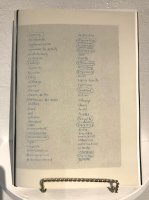
The minimalist cover is devoted to two columns of printed words, with certain words circled for
emphasis. The Verdigris typeface used is reminiscent of cursive text. The blue ink is a result of
"risograph printing, that uses stencils and ink drums to produce prints." The process is similar to
a Gestetner press, commonly used in the local public school system over 40 years ago. The resulting
print has "a hand-made look and feel."
Despite its plain presentation, this entry, published by L’imprimerie centre d’artistes and printed
by Atelier Circulaire, garnered 2nd prize. In their decision, the judges noted:
The format ... suits the origins of the book's composition, and the moody simplicity of the blue ink on black stock is entrancing. The varied content is
sensitively handled to create unity, and the judges loved the insertion of a loose card urging
readers to take care of the fragile object(s).
With a limited edition of only 150 copies,
nous nous emmêlerons proves that not every book,
especially limited-edition books, need necessarily follow established, traditional book formats to
showcase content. It's reassuring to see that risk-taking is both recognized and rewarded on a national level in
Canadian book design.
Extensive background information and additional photos of
nous nous emmêlerons is available at
www.fadingpaper.ca.
The Alcuin Society Book Design Awards exhibition continues to travel the country over the next several months. According to the website, it will be available for viewing again in Halifax, NS at Mount Saint Vincent University's library this fall. The full exhibition schedule is available on the
Alcuin Society's website.
Submitted by Charles Salmon

 It was wonderful to have Jamie Pratt at our meeting last night, speaking to us about Japanese paper. Jamie has been the Halifax area representative for the Japanese Paper Place for over 25 years and she has been a friend of Nancy Jacobi, the founder of the JPP, for even longer. Jamie says she fell in love with handmade Japanese papers because they are so beautiful, exceptionally well made, and have so many different uses. It was a pleasure to hear Jamie's presentation and have a look at all the samples she had for us to examine.
